Mayola

graphic design:
Julia Kędzierska
client:
Mayola

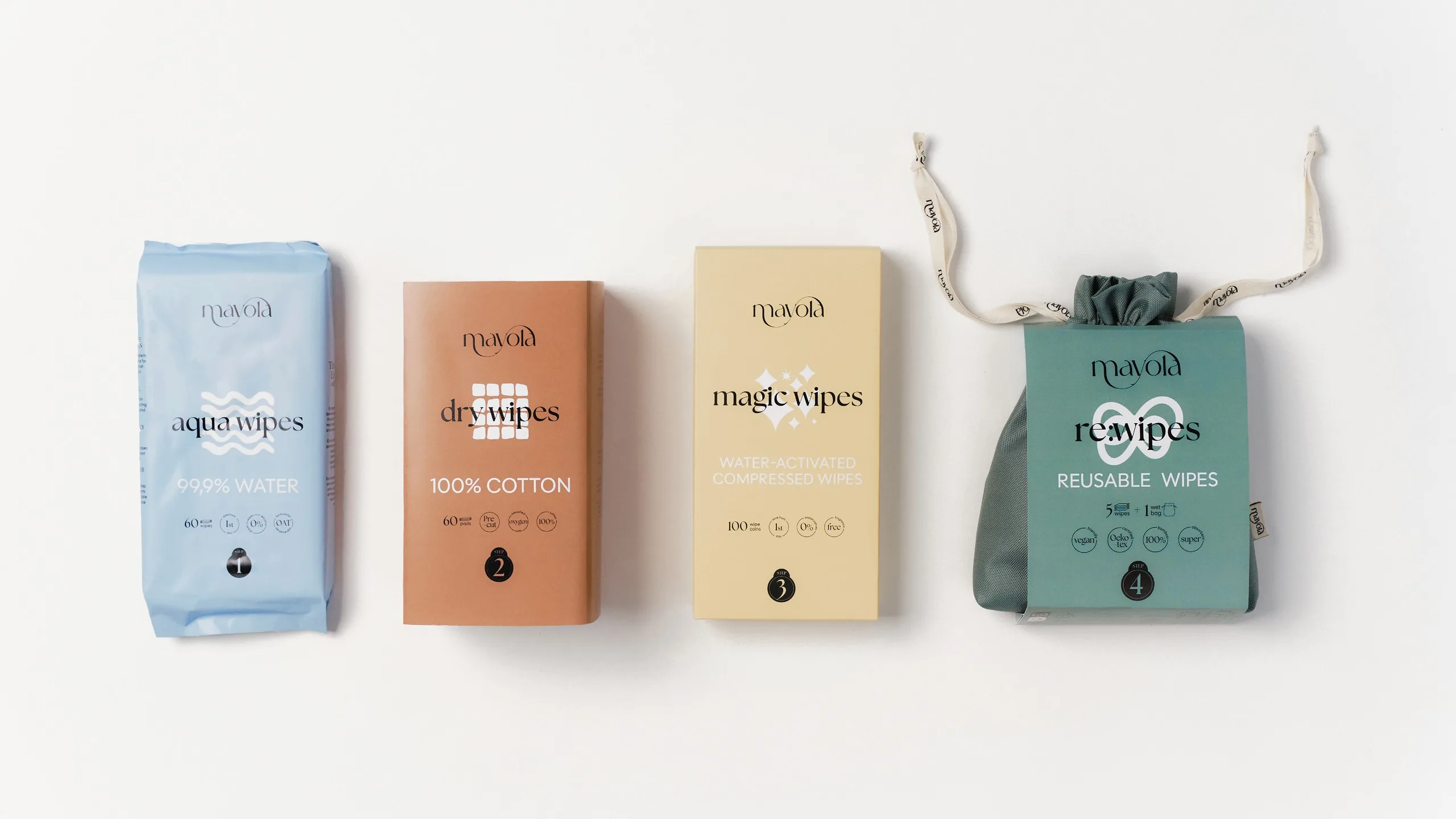
The visual identity for Mayola successfully blends modernity, ecology, and family care. It uses a gentle, trustworthy aesthetic to reflect the brand's core values of safety and naturalness, positioning it as a friendly guide for conscious, eco-friendly choices.

Mayola logotype banner on pale blue
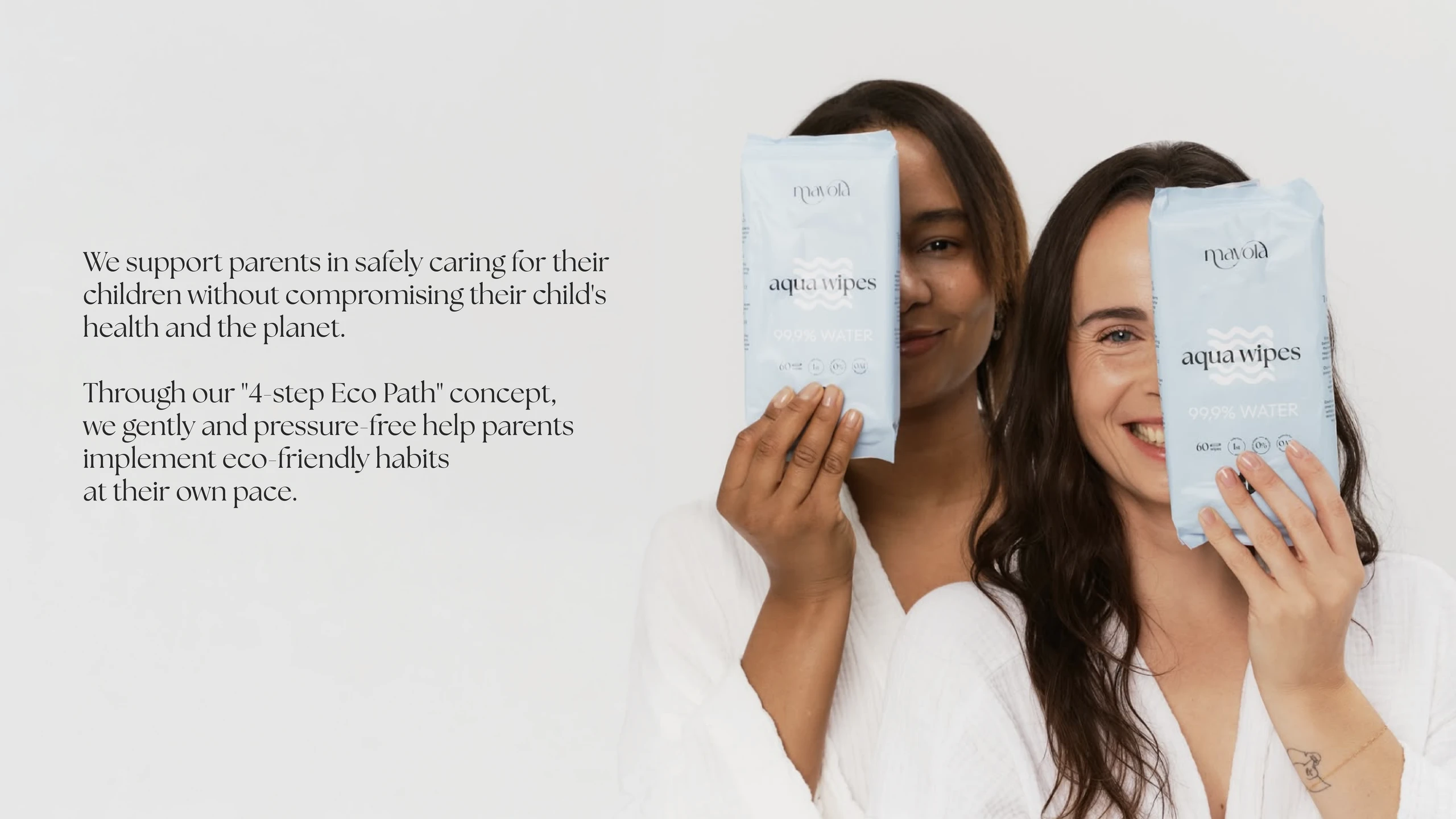
brands idea
Two smiling women in white holding pale blue Mayola aqua wipes packs beside the brand statement about its 4-step Eco Path
typography and colour palette
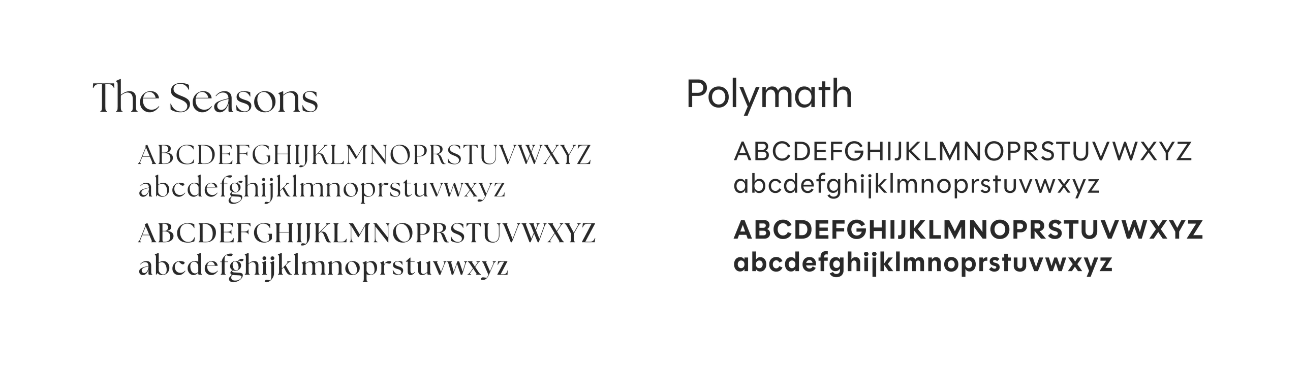
Mayola typography specimen: The Seasons serif and Polymath sans alphabets
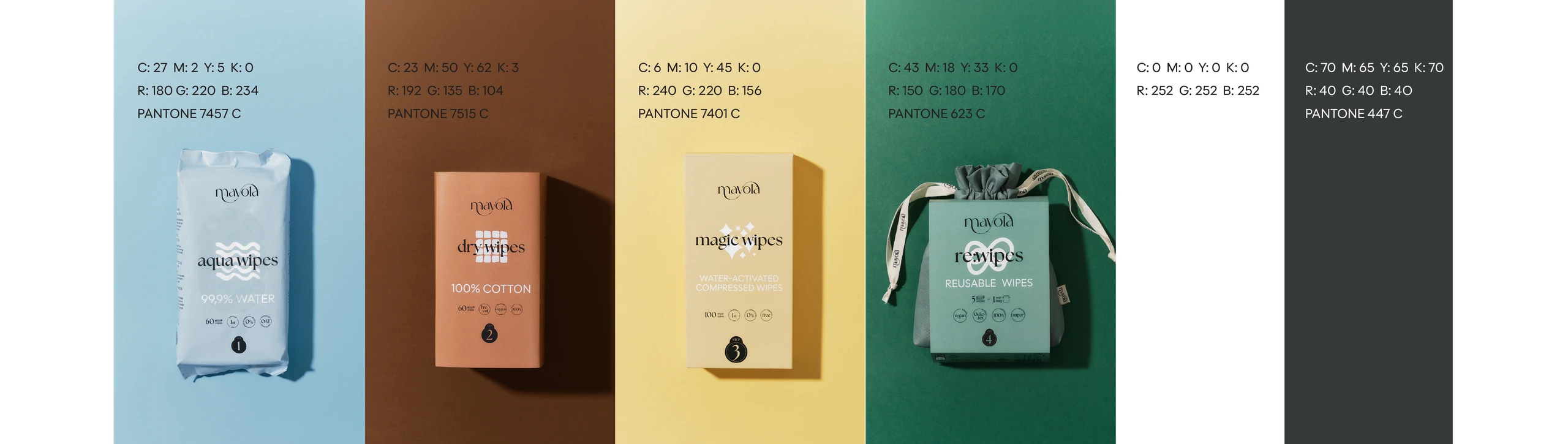
Mayola colour palette: product packshots on pale blue, terracotta, sand and green fields with CMYK, RGB and Pantone values
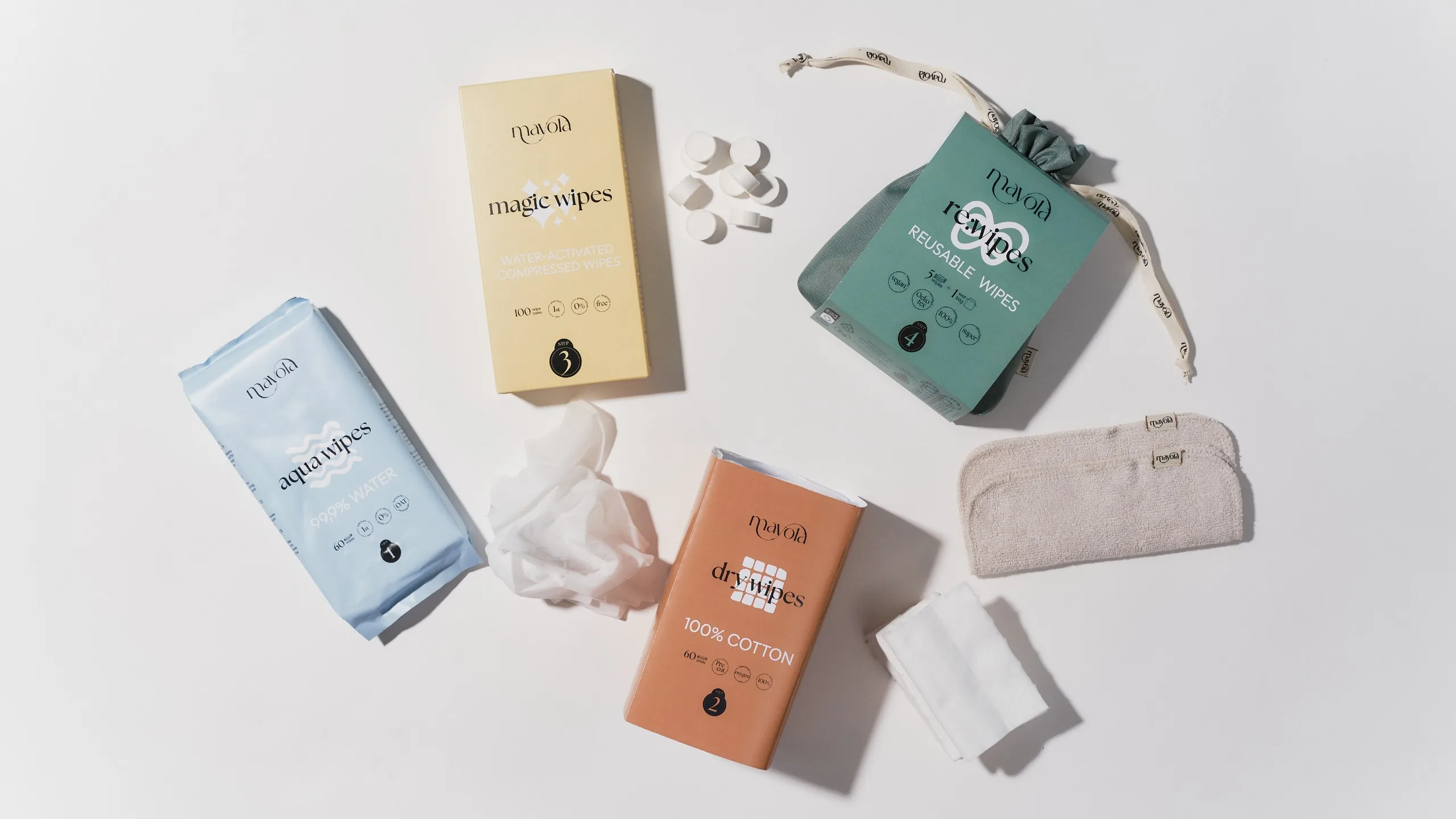
Flat lay of the four Mayola products — aqua wipes, magic wipes, the re:wipes pouch and dry wipes — with loose wipes on white
iconography
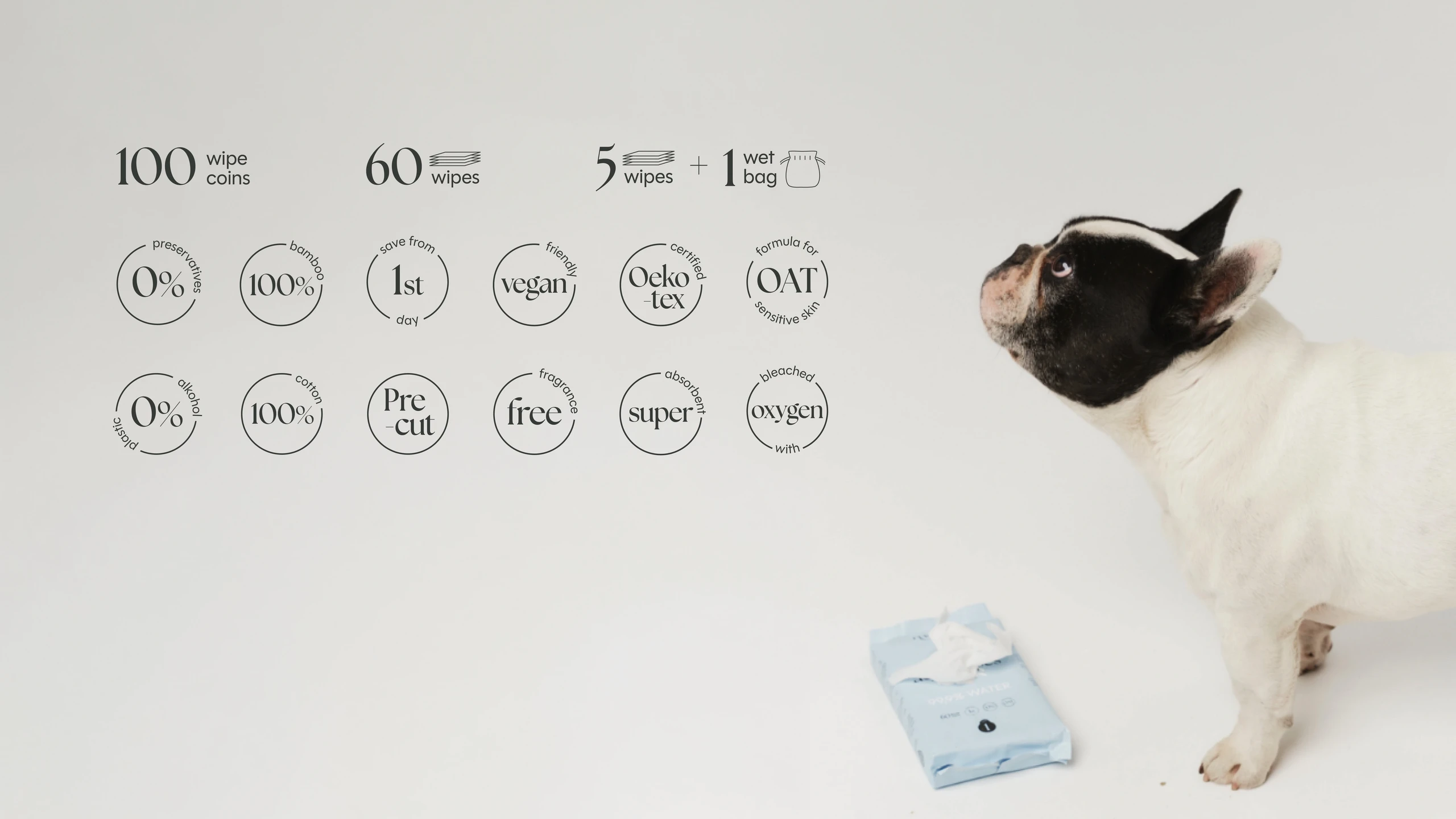
Mayola iconography sheet with product stats and feature icons, watched by a French bulldog next to a pack of wipes
Lineup of the four Mayola packs: aqua wipes, dry wipes, magic wipes and the reusable re:wipes pouch